Century Cellars (Century Wines & Spirits Pte. Ltd.) is the largest Spirits and Whisky dealer in Singapore. They have more than 50k regular customers, 8 retail stores islandwide and got more than 3000 varieties of wines & spirits products.
With a yearly revenue of more than SGD10+ million dollars, Century Cellars is one of the reputed beverage companies in Singapore.
Role & Duration
User Experience Designer & Project Manager
Research, Information Architecture, Interaction, Visual Design & Testing
Team of 3 Designers & 6 Developers
Sept, 2017 - Sept, 2019
The Problem
After analysing the Century Cellars sales record for the past 5 years, it was clear that the online sales is affected due to poor user experience design and poor arrangement of product categories which made the users to feel difficult to search of the needed product.
60%
of support tickets on Trello are UI related issues and are due to inconsistent user experience
35%
of the clients complain that the platform is overloaded with information and looks obsolete.
The primary solution was to come up with a design system that was guided by principles and best practices. Also, to keep with documented at each step to ensure consistency and efficiency of work.
2. Content Management System
To solve the problem of maintaining a hard coded website, the website is planned to be developed using WordPress CMS and it also has to be integrated with the inventory management system for seamless inventory management
The Challenges
1. Getting everyone onboard
A Design System is not a one-man project and if you want it to succeed you need everyone on board. The more integrated you want it the more disciplines you need at the table.
2. Planning & Priority
Failing to plan is planning to fail. We constantly toggle between working on our Design System and enhancing the application and planning and prioritizing our tasks is imperative.
3. Breaking this news to clients
Although, our clients wanted this change from a long long time. Yet, it was important to keep them involved and excited about the big changes we were planning. As a start, this project was done for our key partner clients only.
Discovery
The first step was to review every aspect of the product and try to list all important components on a paper, then group elements by their usages.
For example, style group could be basic assets such as colors and fonts, and components group would include buttons, cards, tables, filters, and etc.
During this process, many inconsistencies emerged. Without worrying out them at that point, I documented everything in the form of screenshots.
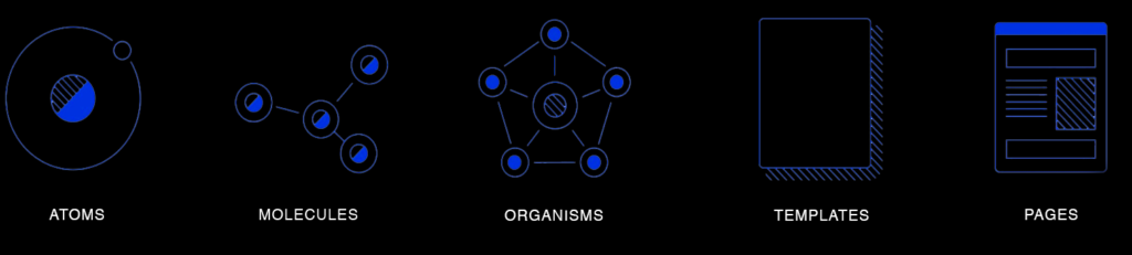
Laying the foundation
This system is based largely on the principles of atomic design. The key idea behind this methodology being small, independent - atomic - parts, can be combined into larger molecular structures.
This foundation loosely defined our typography, colors, icons, spacing, navigation and information architecture. and proved essential for guiding our work in a unified direction. Reviewing our collective work at the end of each day, we began to see patterns emerge.
We course-corrected when necessary, and started defining our standardized components.
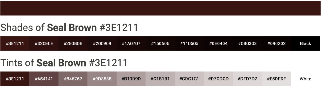
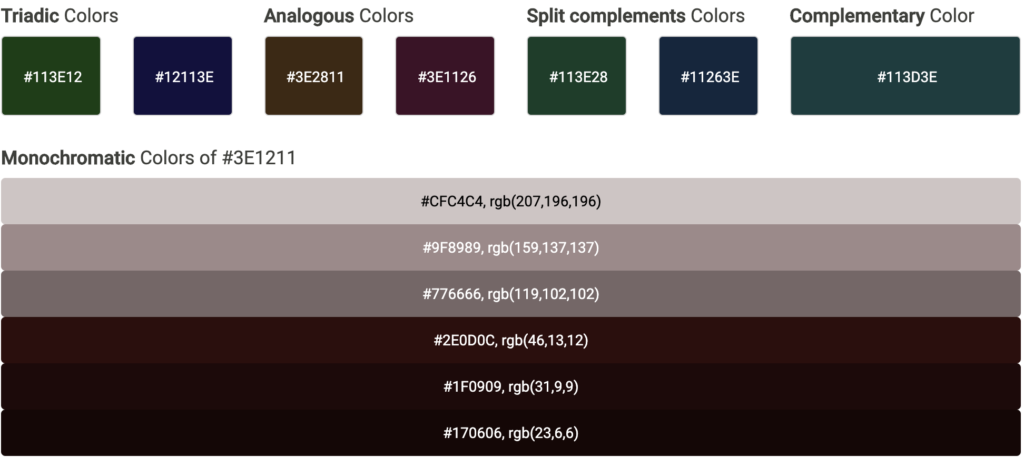
Color Scheme
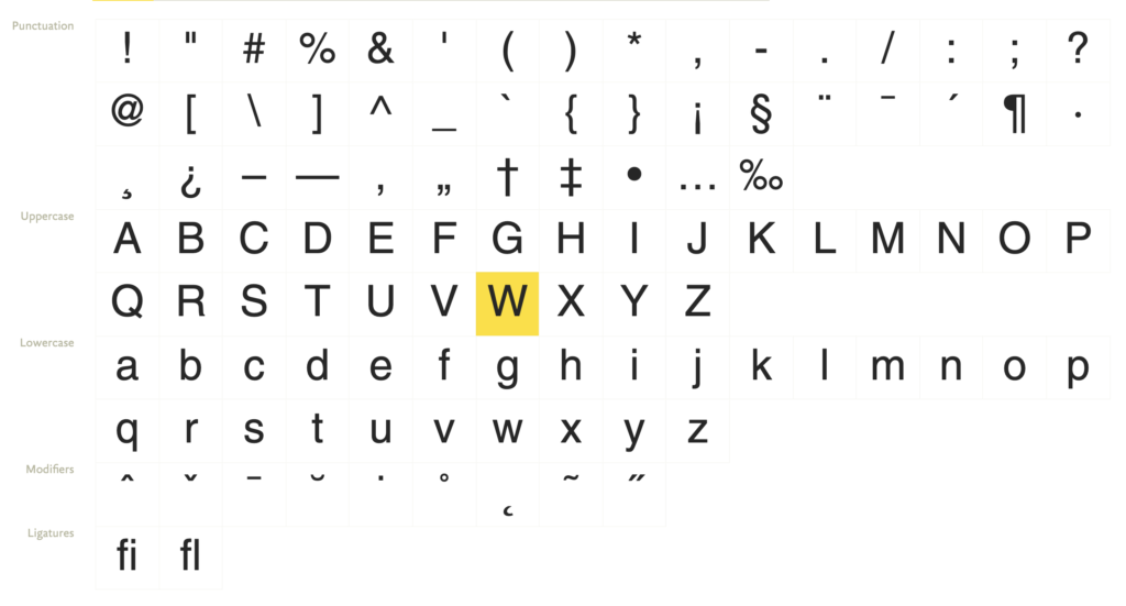
Typeface
We exclusively use Helvetica for the entire website for both Desktop and Mobile responsive dives. Here is a showcase of different ways to structure content:
Bring it all together
While creating these components, we collected them in a sketch master file, which we referred to throughout the design process. After a week or two, we began to see huge leaps in productivity by using the library when iterating on designs. One day, while putting together a last-minute prototype, our team was able to create nearly 50 screens within just a few hours by using the framework our library provided.
While the library was growing, we started organising individual components into artboards containing similar items. These artboards were then organised by general category into Navigation, Marquees, Content, Image, and Speciality. Later we planned on to create an internal website to document the system that can be used by both the devs and designers.
Mobile Responsive
We need to ship our product on a multitude of platforms and devices. Modules and features used on mobile are limited. But, Keeping designs synchronized takes significant effort, often requiring the same work to be repeated across all of these platforms.
With a design system in place, each piece is part of a greater whole and should contribute positively to the system at scale.
Testing & feedback
Testing was conducted during the discovery phase to identify the biggest pain points in the current version. During the redesign: Testing was done at every milestone of the project. Invision prototypes were shared with stakeholders to get early feedback. After numerous surveys and user pilots, we launched the website in April, 2019.
Impact
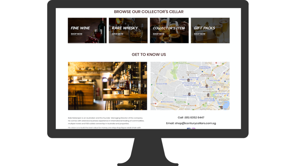
Numerous hours of brainstorming, careful planning, sketching, designing and developing has brought the results desired for Century Cellars online store. We were proud to present the new face of the product to our customers. The final result of the Space design system, a platform is a light, minimalistic, and an intuitive website catered to increase the revenue of the company through online sales and to have better online branding.
40%
increase in online sales
30%
decrease in manual labour cost
2
physical stores closed down
35%
increase in online visitors
Project Learnings
Collaboration is key
The more eyes on a design, the more it’s exposed to varying opinions, experience, and critique — and this can only ultimately improve it. Or at the very least, test it.
Process in essential
For a project that is vast, it gives you a roadmap to navigate through what can be a foggy route. This is especially useful when you’re starting out.