Myceroid is an all in one business operation software startup based in Singapore with a team of 5 engineers. Their vision is to make an easy to use and simple software to manage daily tasks, HR, payroll, claims, rostering, internal communication, etc.
The Challenge
Design a responsive website to attract the users, provide quick adequate information about the product, gain trust and convert them as sales prospects. Give the company a facelift by designing the entire content from scratch that captures the essence of the brand.
The Outcome
An informative and aesthetically appealing website with strong brand identity.
The Length of the project
4 to 6 Weeks
The Role
Lead UX Designer and a web developer
02
Research
During the research phase, I sought to understand the current state of HR based SaaS platforms. My intention for the research phase was to uncover the needs and frustrations of the target users to better understand the behaviour of the user.
The Research Goals
1. Define HR people's behaviour to SaaS software as a whole.
2. Define HR people's view on software features.
3. Determine what HR like and dislike when it comes migrating from manual work to automation or migrating from one software to the other.
The Secondary Research
I conducted secondary research to understand user demographics, developments, opportunities and challenges in automating the HR people's daily duties and responsibilities. I collected informations from articles and case studies to identify industry standard and user expectations.
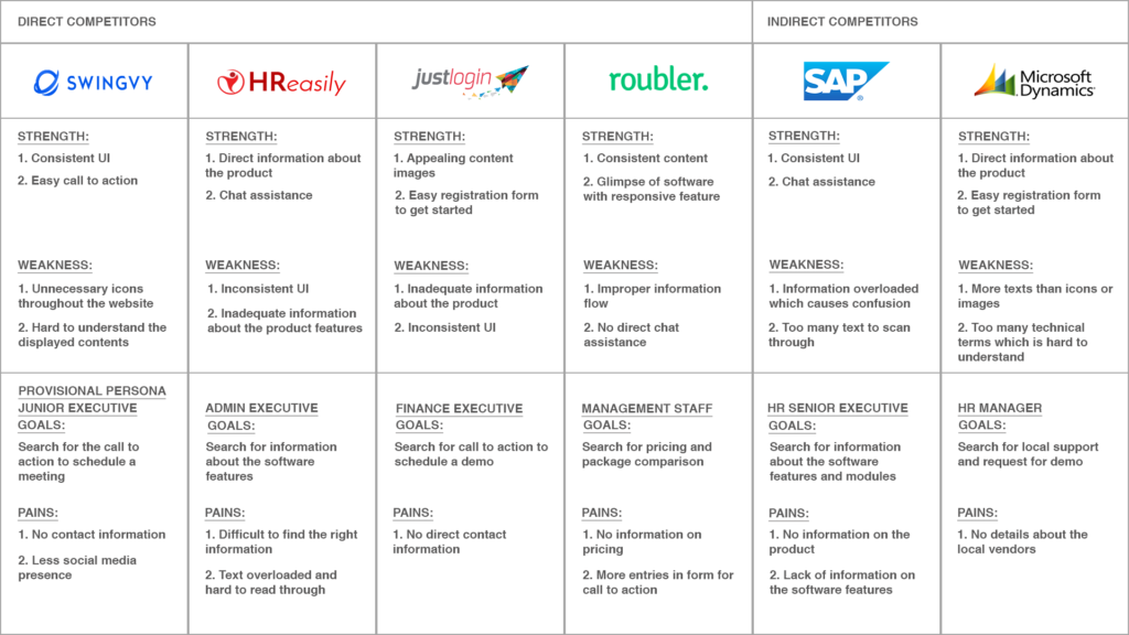
The Primary Research - Competitive analysis
I analysed some of Myceroid's competitors in the HR SaaS industry. I uncovered the strength and weakness of Myceroid's direct competitors such as Swingvy, roubler, HReasily and Just login. In addition, I performed a competitive analysis on SAP and Microsoft Dynamics 365 which are indirect competitors of Myceroid.
My competitive analysis produced the following insights:
Product assistance:
HR people expects the website features that will help them to get the right information about the product. Successful websites are using chatbots that predicts the necessary information needed for the users. Customer reviews with demographic information (location, size of the company, company name) helps them to choose the right modules. This type of assistance reduces the likelihood of choosing wrong modules for their business operation.
Social media integration:
More users get the information through social media to trust the product. SaaS sites are relying on top company HR and business people to try on and give reviews for their product. This not only helps the reputation of the brand but it also engages the customer.
Painless demo request:
Providing direct links or pop ups to request for a quick meet up or demo, has been a major asset for the SaaS industry. People are moving towards a demo feel of the software before they request for the meetup with the company representative or consultant.
Precise information:
Giving more information about the product in words is painful for the user to read through it. Usage of icons and precise information about the features makes it easy to convey the message to the user.
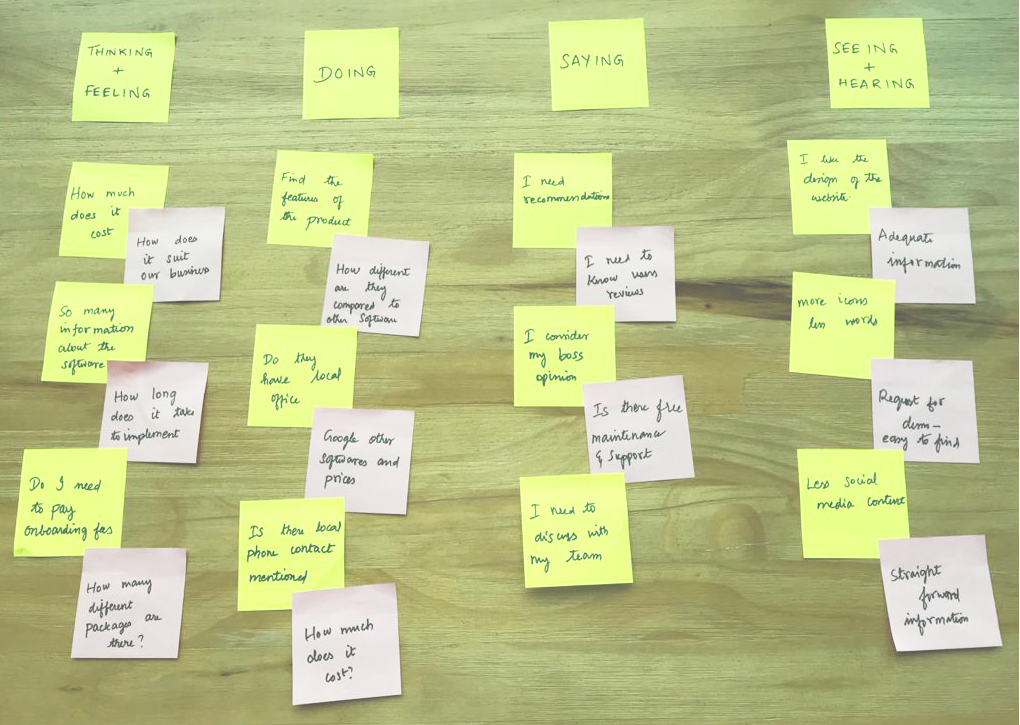
The Primary Research - Interviews
In order to design a website with a great user experience, I had to identify the needs of the target audience first. To better understand the perspective of the users, I had to speak with them directly. I sat down with four human resource professional aged between 30 and 55 years old to ask them about their daily HR activities and their preferences in migrating to an efficient HR software.
The Research Assumptions
1. Price and features are the most important considerations for the users.
2. Users prefer to see the comparison between different package and brief information about the different module of the software.
3. Users prefer to book for a quick demo and discuss about their business needs in person at their premises.
After completing the interviews, I wrote down all the responses on sticky notes and began to cluster them based on topics
Clustering interview responses allowed me to discover trends and patterns from which insights could be constructed. Through the process, I have identified several user needs
Time Efficiency:
All users expressed a desire to complete their search to be organised and stress-free. They want to complete the whole process as quick as possible.
Consistent UI:
Users needs the website to be appealing and trustworthy. They want to find the necessary information easily.
Call to action:
Users need a direct button to request for a demo or a meeting.
Software information:
Users need the necessary information about the product to be direct and less technical.
The Persona and Storyboard Creation
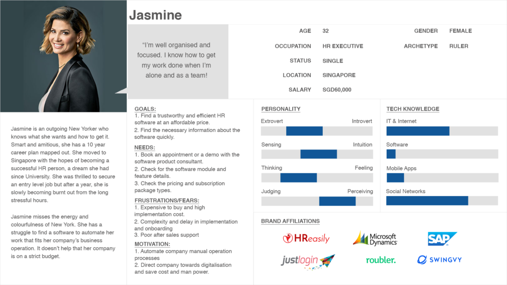
Next, I used all the qualitative data that I've gathered during the research process to create Jasmine, my user persona. Jasmine is an ambitious 30+ year old HR professional in need of a software to automated her manual tasks at an affordable price.
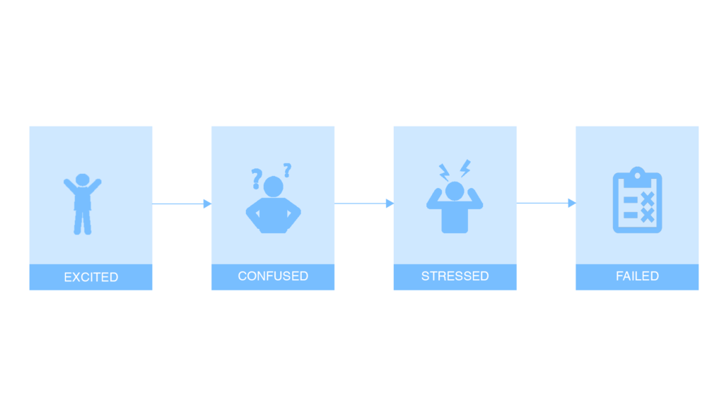
Then I created a storyboard depicting Jasmin's struggle of intensive manual labor work and the solution that Myceroid software provides.
Summary of findings:
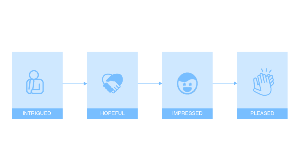
Jasmine recently left her non-profit job in New York to move to Singapore. She secured a position as a HR professional at a mid-sized creative agency. On her first day of work, Jasmine expected a well organised software to handle her daily duties. On her first day of work, she noticed that there is a huge pile of papers on her table which needs to be organised and completed within a week. She tried to complete it but she couldn't. It made her to feel in competent of time management.
After work, Jasmin checked online for a HR software to automate her daily tasks. She comes across a social media sponsored ad in her feed for Myceroid. She is intrigued by the content and visits the mobile website. She could find all the necessary information and she is convinced that she has all the information which suits her needs and she could immediately find a call to action button to book a software product demo and meet one of the consultants. She found the software quite affordable and easy to get onboard. After implementation, she was pleased with the efficiency of the software and after sales support. She found that she could easily manage her daily duties on time with accuracy.
03
Define & Ideate
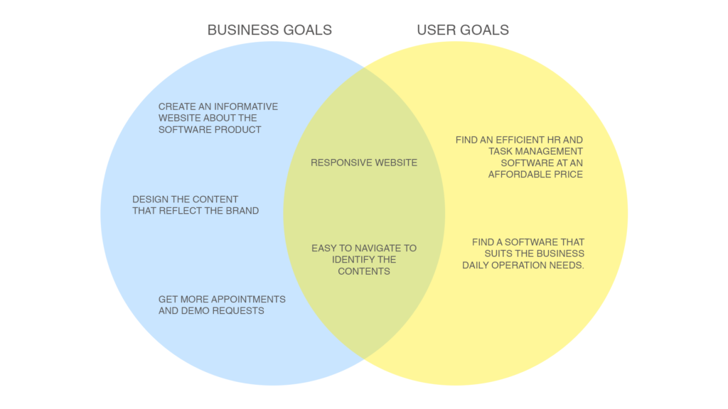
Now that I had empathised with the target users and identifies their needs that I needed to define the solution. I reflected on the business goals, user goals and technical considerations to find a solid medium for all the stakeholders. Once I had identified the common goals, I could decide what product features are necessary for the prototype.
The Technical Goals
1. CMS based website for easy maintenance.
2. A responsive interface that looks clean and organised on all devices.
3. Security feature for safe registration comply personal data protection act.
04
Information Architecture
I created a high-level list of site features to further define and guide the vision of the product. Prioritising the features with supporting research created a clear order of execution.
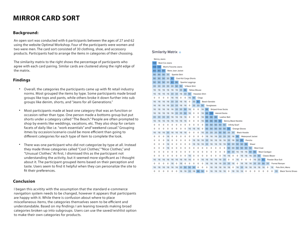
Next, I conducted an open card sort to get a sense of how the categorise the necessary information. I asked the users to arrange the list of options in the website based on the right categories that falls.
The Technical Goals
1. CMS based website for easy maintenance.
2. A responsive interface that looks clean and organised on all devices.
3. Security feature for safe registration comply personal data protection act.
The Findings
I made some assumptions that the standard informative SaaS website navigation system needed to be changed, however the participants' feedback revealed that they were in fact happy with it. While there was a confusion about whether few of the functions are necessary for the website as users have sufficient information focused on features, pricing and call to action button.
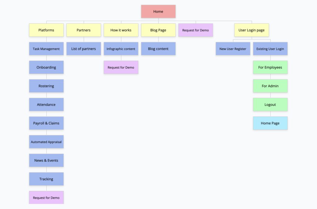
Based on the response trends, I created a site map which laid out the structure and organisation of the content on that site.
The Interaction Design
I completed a task flow and user flow to imagine the ways a user might navigate through the site to achieve their goals. These tools allowed me to ensure that the information was organised in a way that is intuitive to the user.
The Visual Design - Branding
At this point in the process, I began to think about how the website would look and feel to the visitors. I came up with a series of descriptive words that captured the essence of the Myceroid's brand: Fresh, modern, quality, affordable.
05
Design
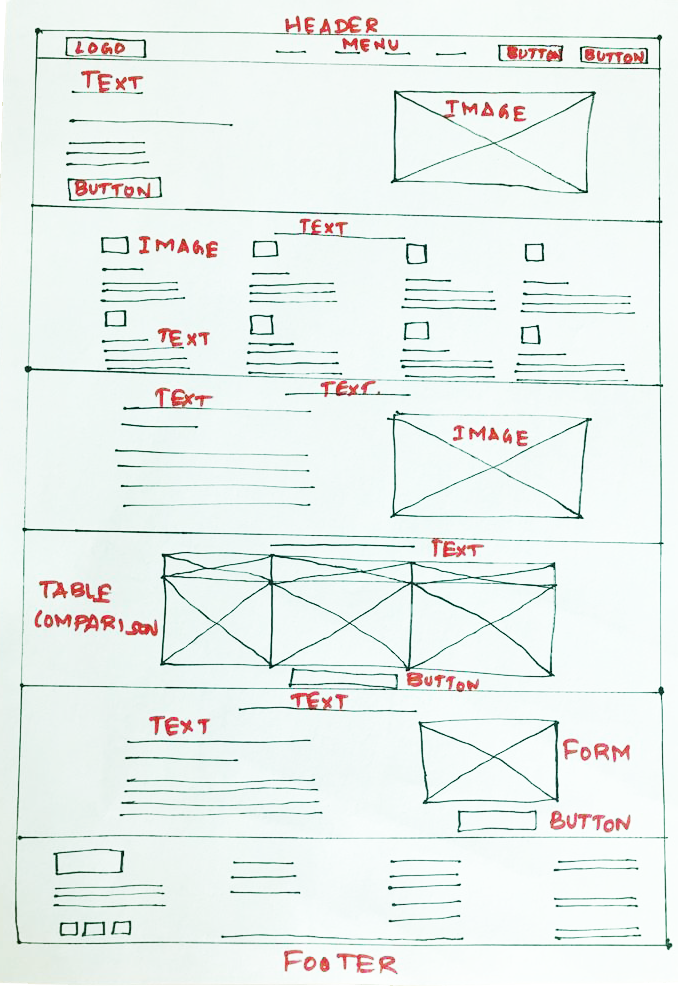
The Low Fidelity Wireframe
I began the process of wire-framing with sketches of variations of the website landing page. During this process, I thought about how the layout and content could be structured to satisfy user and business goals in a technically feasible way. The sketch I chose served as a guide for my digital wireframes.
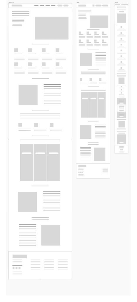
The Mid Fidelity Wireframe
I created a low-fidelity prototype of the desktop site in Sketch. I created a UI requirements document to outline all of the features and elements I wanted to incorporate into the design.
At this point in the design process, I needed to think about how I wanted the site to look on different screen sizes. It was essential that the website would present as well on tablet and mobile devices as it did in desktop size. I created responsive wireframes for Mirror's key pages and began to flesh them out.
06
Typography, Color scheme & Icons
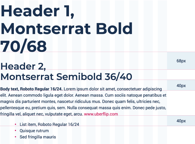
The Typography
Based on the logo and the branding, we choose Montserrat font for all the headings and the paragraph.
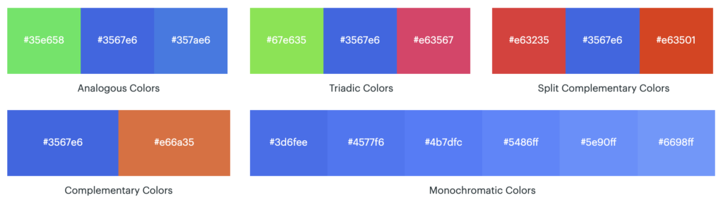
The Colour Scheme
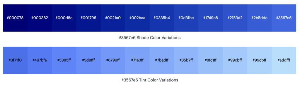
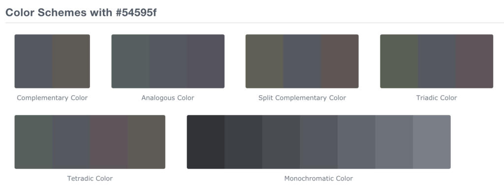
In order to differentiate the buttons and the text, we choose two colours for the website theme such as #3567e6 and #54595f.
The Icons
1. Literal type: the icon image and the icon name represents the same intended physical meaning or action(Ex: scissor icon for cut, trash icon for delete, etc.)
2. Metaphorical types: the icon image and the icon name are different but the meaning is related to the physical concept of the icon image or an hidden comparison between the icon image and the icon name (Ex: gear for settings, bulb for concept of an idea, etc.)
3. Universal types: Rare to find and recognised among the users. (Ex: Floppy icon for save, etc.)
4. Abstract or unique type: Custom designed icons especially used in creating logos. (Ex: “a” for amazon, “G” for google, etc.)
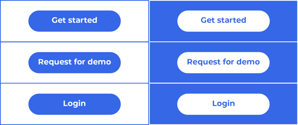
The Buttons
We use button to call for action. The buttons are used to login, get started and request for demo.
07
Prototyping & Testing
The High Fidelity Prototypes
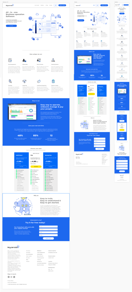
After several iterations of my low-fidelity prototype, I fleshed out the details of each page with images, typography, navigation menus, etc.
At this point in the design process, I needed to think about how I wanted the site to look on different screen sizes. It was essential that the website would present as well on tablet and mobile devices as it did in desktop size. I created responsive wireframes for Mirror's key pages and began to flesh them out.
08
Website Preview
To preview the live website of Myceroid, please click the button below: